Review Build: Targaryen Sigil

Review Build: Targaryen Sigil
Some of you may be surprised to hear that I have never seen Game of Thrones, and I have no intention of doing so. Considering how much I enjoy fantasy and dragons, it seems ironic. But I have my justifications. However, that doesn't mean I can't create models inspired by the program! Thanks to Metal3dpuzzles, I created and provided an honest evaluation of the silver version of the Targaryen Sigil. Don't worry, I also received the Drogon model, so that will be shown on the blog later. My backlog is now rather large.
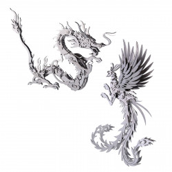
Would you not know? The symbol is a dragon with three heads! How practical. Since I really enjoy wolves, it goes without saying that the other insignia looks excellent. However, I have yet to obtain that one. I think most of the Game of Thrones models are pretty cool, and I want to construct and collect them all. However, this was a good place to start.
Additionally, I was in the mood for something really straightforward, and I recalled AnimateOrange talking about how it comes together rather quickly. He wasn't mistaken, either.
Furthermore, something does not necessarily appear more straightforward just because it is easy. This concept is excellent since it allows you to give the sigil elements greater dimensions if you want to. And I did. The base that the sigil seems to be embedded in is stony and crystalline-looking, and I really like that.
Given that I've previously discussed the challenge level and built experience, I've deviated from my regular writing technique for these blogs. I should clarify, though, that I mean "fairly simple" in a very relative sense because I've been working on a lot of more intricate and complex projects lately. This model has some precise angles and alignments as well as some folds that aren't precisely square or flat. On the other hand, this is a two-sheet ICONX model with very few sections, some of which are relatively large and have few, if any, folds. Additionally, I want to draw attention to something obvious, but I will say it nevertheless. Both the vintage silver and the limited-edition colorful version available from Barnes & Noble should be covered in my analysis of the construction process here. Although the colors give the symbol more contrast, I wish I had the color version, but I won't gripe. Since I received this one for free, and because the build procedure is the same, that's the aspect I like the most.
I did choose to give the dragon in the symbol some additional dimension, as I mentioned before and as you can likely see from the pictures. Being myself, though, I didn't restrict it to the single wing mentioned in the directions. You may even add additional curves to the dragons' necks to make their heads somewhat higher if you are cautious and observe where the components intersect. Adjust the horns, ears, or other features on the backs of those heads if you're feeling particularly daring. In regards to the wing, you can fold it out as recommended and, if you'd like, give it a slight curve or round along its length. In order to provide the impression that the rear wing is slightly recessed from the main body, I also drew the central body forward and slightly lifted one of the feet. I felt it was worth a try, even though that aspect didn't work out as well.
Regarding the attachment of the enormous sloping ring around the exterior of the sigil face, I would like to thank AnimateOrange for pointing out a minor detail that should have been included in the instructions with one of those "pay attention" pointy-finger icons. I discovered this by watching his build review video, which you can view here. In any case, when attaching the ring to the front of the sigil, you must be very careful to observe the tabs on the rear of the ring. Three tabs—two on the sides and one at the top—will protrude from the rear. There won't be one at the bottom. The sigil will not be upright when attached to the base if this is not aligned with the orientation of the sigil face, which is relatively easy to do. Make sure you get that right, then.
Forming the different crystalline-like crags that comprise the base will take up most of your time on this project. They also seem surprisingly easy. They aren't as simple as they seem, but they are still simple. Sometimes, you will have a face that twists somewhat across the surface plane because the folds are not 90-degree straight angles. However, it is self-correcting as long as you adhere to the etched instructions and place the tabs in the appropriate holes. My motto was "just kind of fiddle it into alignment."
The tiny metal strips that connect the front and back of the model and cap some of these crag-like structures are actually the more challenging aspects of this creation. Numerous close folds appear to be at random angles. Although it can be difficult to fold some of them to the necessary sharp angle thoroughly, they will ultimately get there. For these pieces, I suggest getting a rough/estimate folding in first and then worrying about accuracy only when you are actually fastening the tabs to the slots. Don't tinker too much at the beginning; instead, use the silhouettes of the objects you plan to attach the strips to as a guide. Keep in mind that the more you fiddle fold, the weaker the fold's bond will be. To be safe, I secured the majority of the tabs before determining the precise fold angles for a few folds.
That's the only advice I can think of that you should heed. This model doesn't have many curved areas; it primarily consists of simple folds, albeit at some odd angles. It took me just under an hour and fifteen minutes to complete in one sitting.
